Twitter’s New Cover Shot Header Image – A couple of tips...
We’re all used to Facebook making changes – so we can’t really moan too much that the comparably steady and static Twitter has introduced a recent change.
The buzz on the net is that Twitter is taking a page out of Facebook’s Timeline – however, I think that’s way too extreme. This change is a mere tweak compared to the epic changes incurred by Facebook’s Timeline. 
Effectively, as the change stands at the moment – you can effectively enhance your Twitter profile by including a background header image around your profile pic. Great for brands and enables individuals to get a bit more creative too.
The catalyst of this change appears to be the Twitter for iPad App recent update. The updated App showcases the option to include a Header image. Simply select to update your Profile using the iPad App and select your Header image.
If editing your profile from your desktop (which is what I have done). Then you simply have to create an image and sit it on your desktop so you can upload it from there.
To edit your Header you will need to select ‘edit profile’ and click the cog image settings wheel in the right hand corner of your profile. When it opens up the list of options to edit, click Design – and then you will see ‘insert Header image’option in bottom right hand side of the screen.
Simply select ‘insert header image’ and pull the image sitting on your desktop through – et voila.
Getting your Header Image Right
The size of your image is stipulated as a minimum size of 1252 x 626 (pixels) and no more than 5MB in file size.
The current formatting options mean that you can’t actually change the colour of the text that sits on top of the Header image at the moment (I’m sure that will follow).
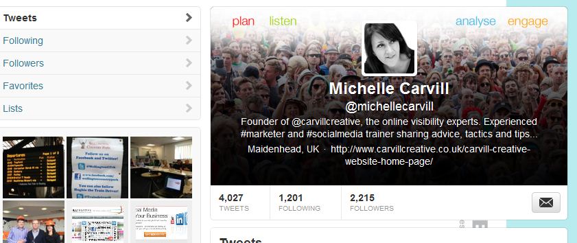
Therefore, all text which is pulled through (and the text is your all important keyword enabled and # infiltrated bio and web url call to action) is showcased in white. And so – if your image is really busy or very light in colour – then your bio text gets lost and that all important content becomes illegible.
We played around with a few options before we got to this – and you can see that it meant we had to darken our image to ensure clarity of the bio. So, for now, until more options appear for us to edit text, then do consider this when creating yours.
Our view in the team so far is that we like this new tweak from the team at Twitter. I look forward to seeing how people get creative. I’ve already got some business cards via www.moo.com which showcase our Facebook cover shot – so just let’s see how long it takes for creative business card options around our Twitter cover shots.
@Michelle Carvill is owner and Marketing Director at Carvill Creative – the online visibility experts. A digital marketing and design agency based in Maidenhead, Berkshire. The agency covers all aspects of marketing strategy and online visibility - covering social media marketing and social media training, user focused website planning and conversion focused website design.
Want to talk to the team at Carvill Creative about your social media activity or training needs? We’re happy to chat, so simply ‘get in touch’.
Finally, why not download our useful Social Media Marketing Planner and Marketing Plan. They’re totally free to download and use.

